02.02.2020
MICHAEL MALTZAN'S RADICAL
HOUSING DESIGNS STRETCH
THE LIMITS OF WHAT'S
POSSIBLE IN ARCHITECTURE
Alex Bozikovic
Architecture Critic for the Globe and Mail
Once upon a time, innovation happened at home. Modernist architects imagined new cities with spaces for all: glass towers to house the masses in style, novel private houses to cradle different forms of family life.
New houses and apartments rarely give us that feeling of exploration, but the architect Michael Maltzan is determined to bring it back. The housing his studio designs – which ranges from custom houses to buildings for the Skid Row Housing Trust in Los Angeles – consistently stretches the limits of what’s possible, technically and conceptually.
“Housing was absolutely central to the evolution of Modern architecture,” he said recently from his Los Angeles office. “And I think it still has that importance today, as cities are under enormous pressure around equity, affordability, and in other dimensions. How we live is a critical question.”
And his studio is asking such questions with two residential buildings in Canada: one for the University of Winnipeg Community Renewal Corp. and one, recently announced, for the University of Toronto. These buildings “are not just a series of hotel beds for students, but are quite literally the centre of their lives,” he said. “They shape how the residents interact with their fellow students,” and with the world.
The Winnipeg building, designed with Cibinel Architecture, is located at 290 Colony St. – just opposite the firm’s Inuit Art Centre extension at the Winnipeg Art Gallery, scheduled to open in November.
Like the WAG, 290 Colony will have an irregular form and white cladding. It’s a tower of student suites, its mass split up into wedges that spread out into a semi-circle, to “give the impression that the building is turning with you,” Maltzan told me. A set of square windows, scattered across the façades like confetti, “creates a strong identity for the building from the outside,” he said.
And from the inside, they are lenses. “They’re intended to give you these telescopic views of different points of the city. You know when you’re on top of a tall building and they have telescopes aimed out to different monuments? These windows are doing something similar. It helps to keep you in conversation with your city.”
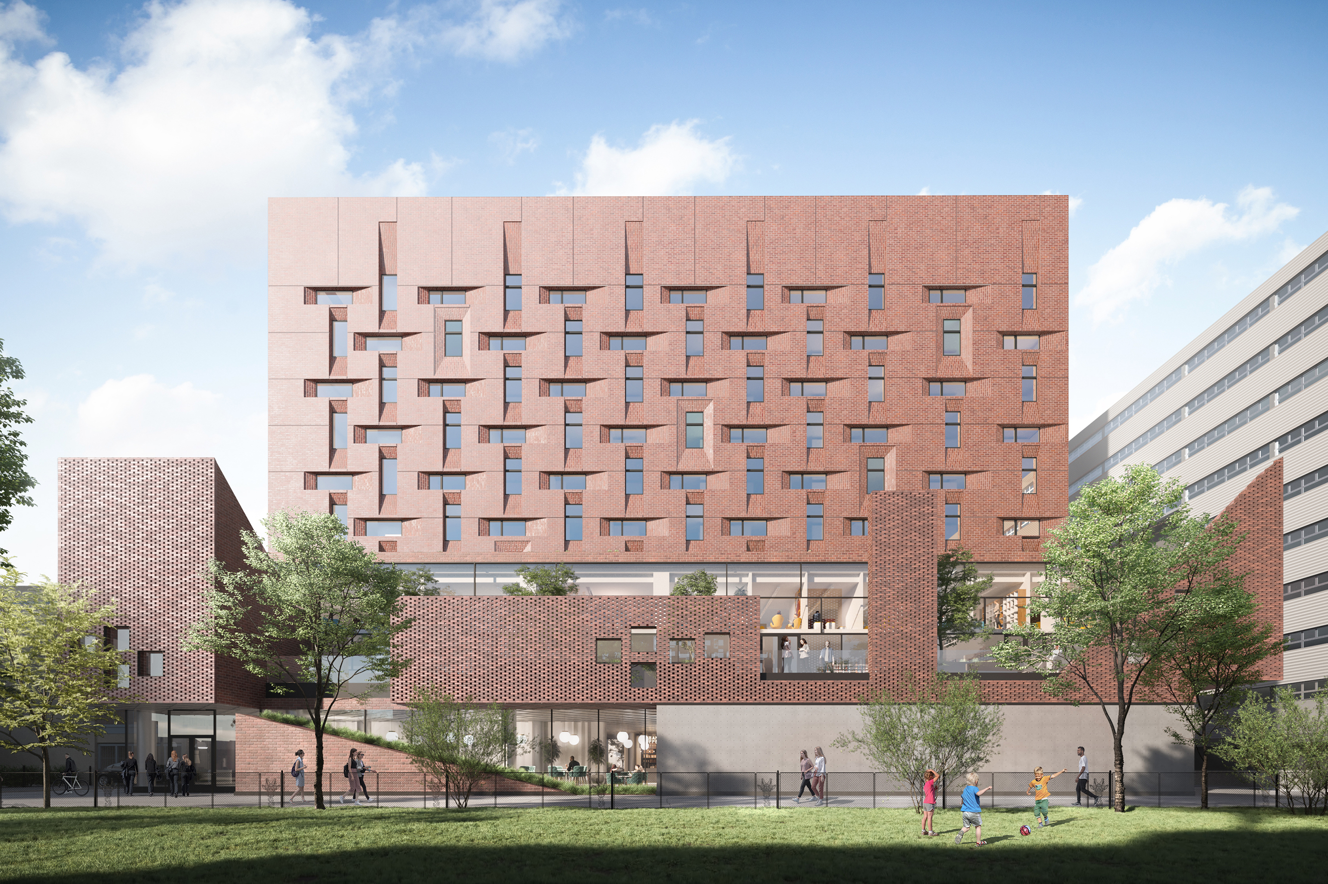
The Toronto building at 40 Harbord St., designed with architectsAlliance, is in some ways more conventional. It is rectilinear, and its cladding will be brick. The choice of material (which will be prefabricated on panels) seems to be a contextual move: Toronto is a brick city, after all.
Maltzan acknowledges as much. But here, as in other recent projects, he’s using this familiar material to play games with perception. “With brick,” he said, “buildings that might seem quite heavy from far away, as you get closer, give you a different perception – of being light.”
Seen from the street, the building appears largely a solid mass of masonry. But up close, the brick reveals some texture: it slants inward toward each of the rectangular windows, reading more like a weave than a wall. And down at ground level, the back gives way to glass and to three entrances, one to a cafe and “marketplace,” one to an event space and one, the smallest, just for residents themselves. Architectural nuance helps to build community.
In both buildings, the exercise of spatial imagination reflects some ideas that Maltzan has been exploring. One common thread in his recent work is the use of sightlines – he uses the term “visual skewers” – through the building. Just as the Winnipeg tower opens up unexpected vistas to the city, the Toronto tower has big swathes of window on its most important facade: the one that looks back to the centre of the university campus.
On this wall, the veil of brick falls away to expose irregular, two-storey windows, one nearly a circle, that open up to lounges and stairways within. From there, “you’ll get extraordinary views to the university,” he said, “and you’re connected to this larger context.”
The Toronto building is connected to its context in a larger way: at the back, it rises in three “popups,” as the architect calls them – two-storey volumes of irregular form, made of perforated brick. Two have sloped roofs and vaguely recall the forms of the Victorian houses that surround the campus.
Maltzan’s work is generally driven by a sharp analysis of economic and social conditions: It’s a poetry of the possible. My favourite of his recent projects, the remarkable One Santa Fe housing in downtown Los Angeles, stretches blocks along the side of a railyard. It’s a whole neighbourhood of 400 homes organized not as a tower or as a block but as a narrow strip of red and white, pulsing with life. It, like his affordable-housing projects nearby, delivers a livable but surprising idea of home.
So what’s going on in Toronto? Why the brick, and why the nods to Victorian architecture? “I think it’s important to talk about the characteristics of a place,” Maltzan explained. “Trying to understand what’s fundamental to it: colour, texture, scale – not a literal historicism. But what makes a place something that you experience in a consistent way?” What makes you feel at home? Maltzan will give it to you, but with a twist or two, making home feel exhilaratingly new.
Editor’s note: In the case of The University of Winnipeg residence building, it is not restricted to student use.

