IN METROPOLIS
Michael Maltzan’s Hammer Museum and the Anti-Bilbao Effect
Michael Maltzan’s gradual renovation of a Los Angeles art museum points the way to cultural architecture that engages with its context rather than focusing on flash.
by Sam Lubell
About 25 years ago the Guggenheim Museum and Frank Gehry launched the Guggenheim Bilbao, a billowing titanium marvel that almost single-handedly altered the course of museum and civic design. By the new millennium everybody wanted a Bilbao; a flashy, sculptural piece of cultural architecture that could put their city on the global stage through bravado, novelty, and, of course, press coverage. Rome got Zaha Hadid’s convulsing Maxxi. Doha, Qatar, got I.M. Pei’s block-filled Museum of Islamic Art and (much later) Jean Nouvel’s fitful, Desert Rose-inspired National Museum of Qatar. Denver got Daniel Libeskind’s dizzying addition to the Denver Art Museum. Mexico City got the glittering Museo Soumaya. Even Chattanooga, Tennessee, got in the act, with Gehry protégé Randall Stout’s Hunter Museum West Wing, a metal and stone dead-ringer for Bilbao.
Michael Maltzan Reimagines the Hammer Museum, Gradually
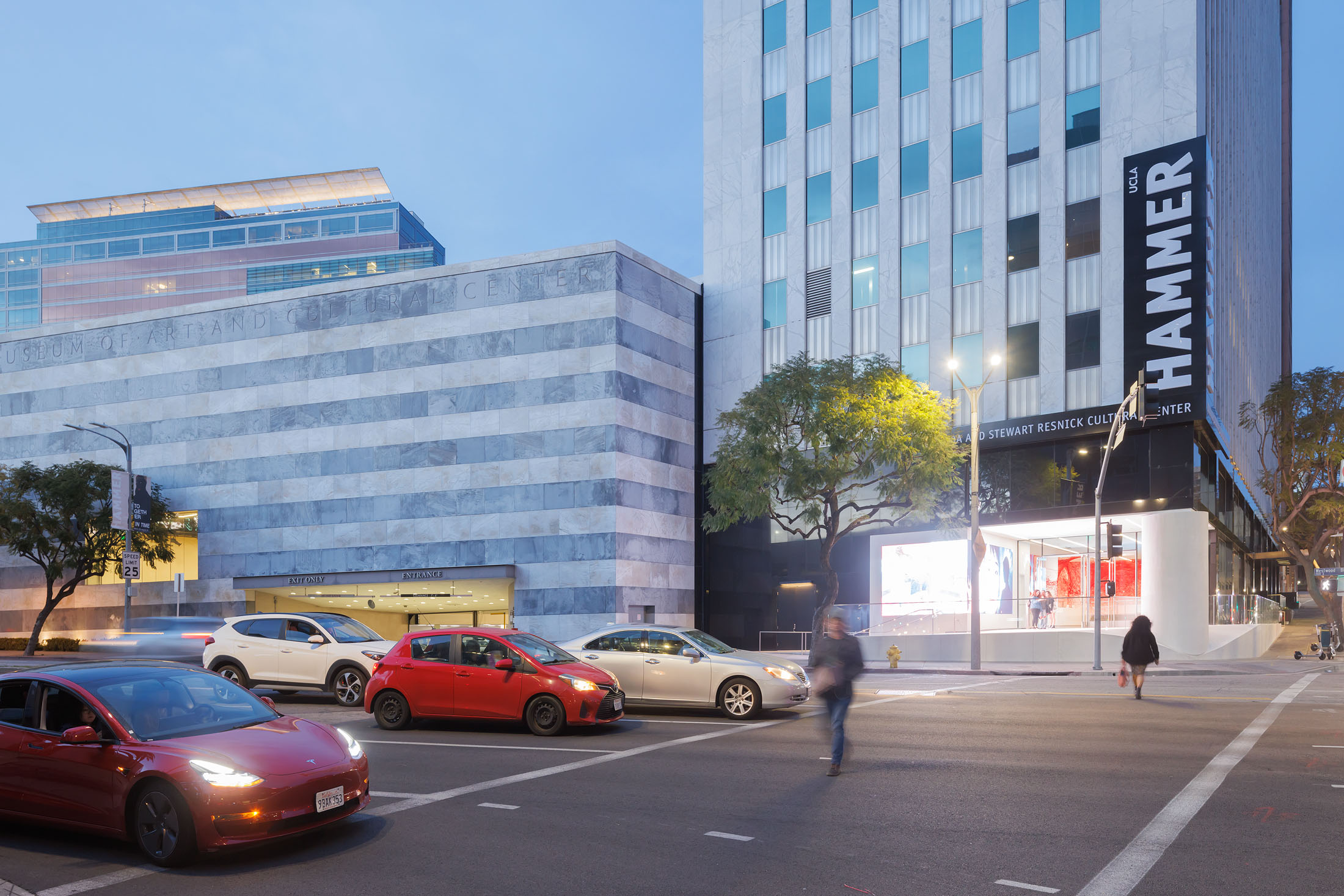
On March 26 UCLA’s Hammer Museum in Los Angeles celebrated the completion of something exceptionally different: the most recent phase of its ongoing transformation, led by local architect (and former Gehry employee) Michael Maltzan. The architect has been working on the museum in phases since 2000, collaborating with director Ann Philbin to surgically and methodically convert the Hammer, designed in 1990 by architect Edward Larrabee Barnes, from a backward facing, siloed, hermetic place to a fresh, highly relevant institution, intimately connected to its offerings and community.
Accrued changes, almost imperceptible over time but radical in their totality, have included reimagining a forgotten courtyard into a vital, sun- and plant-filled public space; replacing an underused colonnade with the Billy Wilder Theater, a vibrant space for lectures and screenings, and adding a now-beloved Alice Waters restaurant, Lulu, in place of another colonnade. Maltzan has also connected scattered second-floor galleries via a pedestrian bridge, and drastically expanded and improved exhibition and learning spaces by lifting ceiling heights and installing new lighting and service systems.
The latest phase takes advantage of UCLA’s 2015 purchase of the adjacent Occidental Petroleum Building creating a more active and open presence on L.A.’s busiest corner, Wilshire and Westwood. It adds a new sculpture court and large-scale exhibition gallery; creates a spacious new lobby filled with revolving art installations and a new education and event terrace; reformats and expands the museum store and opens it to its urban surrounding; and adds copious gallery and research space on the museum’s third floor.
Global Museum Priorities Shift toward Community
These architectural interventions have taken advantage of the museum’s fresh new curational direction and amplified local attributes like beautiful weather and surprising energy to slowly but surely modernize and vitalize this once forgotten spot into what Maltzan describes as “a more engaged, accessible, vibrant cultural center in Los Angeles.” It’s an effort that has dovetailed perfectly with a macro shift in global museum priorities from what Maltzan calls “opaque storehouses for the preservation of a collection” to “places of civic importance and social importance at the same time.”
Bilbao, of course, fulfilled these goals too, becoming a global destination and a groundbreaking piece of architecture. But the way it accomplished this—through bold artistic virtuosity above all—seems to be shifting. Grand statements still have their place Gehry himself is building a new Guggenheim in Abu Dhabi that looks like it could be more riotous than Bilbao and Peter Zumthor is creating an oozing form hovering over Hancock Park for LACMA. But more often, the glittering sculptures of starchitects have been supplanted with artful buildings that foreground a museum’s collection, location, and community. Call it the Anti-Bilbao Effect.
The Anti-Bilbao Effect around the World
This movement has taken myriad forms. One approach is exploring and exploiting local history. For instance, Herzog & De Meuron famously reimagined London’s Bankside Power Station, with its cavernous turbine hall and gritty boiler house, into the Tate Modern, then employed a similar palette to shape a folded, pyramidal addition. In three phases, Bruner/Cott converted a 17-acre, 19th-century industrial complex into one of the largest, and impactful, contemporary art museums in the country Mass MoCA. And Renzo Piano rethought A.C. Martin’s 1939 May Company Department store—best known for its corner tower, made of 300,000 gold glass mosaic tiles— and adding a floating, spherical theater space to create the new Academy of Motion Pictures Museum.
Other approaches include diving into landscape, like Thomas Phifer’s addition to Maryland’s Glenstone Museum, in which he imbedded a series of serene concrete pavilions into both the landscape and a lily-filled reflecting pool. Channeling culture, as Nouvel recently did at the Louvre Abu Dhabi, with its dappled emerging from its latticed steel dome, and smaller scale alleyways and buildings that like walking through a souk. Some projects have combined both, like JKMM’s Amos Rex museum, creating hill-like buildings that double as an imaginative plaza, connected fused with the adaptive reuse of Helsinki’s 1930’s-era Lasipalatsi building.
There are so many more imaginative ways that collections, context, and culture can inform the best of today’s museums. Generally, such projects are not about being minimal or maximal, but about finding inspiration, utility, and room to experiment through deep engagement. In Paris, architect Albert Lenoir’s addition to the Musée de Cluny plays past and present with a rusted cast iron facade that forms a sort of contemporary artwork while infusing the colors and textures of its site’s ancient remains and the filigree patterns of Gothic architecture. In Hong Kong, Herzog + De Meuron’s M+ Museum creates a transporting interior and a stunning exterior exploration of Hong Kong Harbor, while its massive LED screens project digital artworks from the collection over that harbor, making the collection itself into a sort of facade. In Rotterdam, MVRDV’s Depot Boijmans Van Beuningen literally reflects its museumpark site through a mirrored facade and has become the first museum to share its entire collection with the public.
A Reaction against Architectural Globalism
The public has soured on the Bilbao Effect, in part because it has regularly failed to live up to its promise. Starchitects are now viewed less as virtuoso urban saviors and more as over-the-top, increasingly familiar agents of globalism and global capital, monopolizing the architectural landscape to the detriment of talented local firms. In most cases, cities didn’t see the dramatic turnarounds they had envisioned or didn’t understand that creating a metamorphosis involved much more than erecting a shiny building.
Too often those dramatic designs failed to meet museums’ needs. In Denver, Libeskind’s addition is held up as a mind-bending cautionary tale for how buildings can distract from the experience of seeing art. In fact, many institutions wound up badly hurting themselves in the pursuit of mammoth-priced architecture, like Santiago Calatrava’s addition to the Milwaukee Art Museum, which led directly to the institution’s inability to remain solvent. Zumthor’s gambit at LACMA is already several hundred million over its original budget, and there’s no telling how it could impact that institution and the public.
Integrating the Hammer Museum into the City
The Hammer, conversely, only added additions when it had raised the funds, which also helped keep each round of work relevant to the museum’s latest needs. It’s never been a quick, sexy fix.
“It was as much about cutting holes and apertures; creating connections visually and physically within the building; being inventive in ways you can add space,” says Maltzan. “It was always thinking of the Hammer as a kind of physical armature for the activity and the life of the city and its programs.”
Indeed, the museum has become an important part of the Los Angeles cultural scene and admirably fulfilled each of its lofty goals; taking its time to engage in the messy business of budget, context, culture, and architectural constraints. It’s not perfect: outside it could perhaps use a little more Bilbao, helping stand out in what is an impossibly busy part of the city. But that doesn’t mean it’s not a success. Architecture is a practical art, serving clients, communities, and cities. Diving into the needs, challenges, and restrictions of a place and its surroundings is not easy, but it often yields a rich, authentic, and ultimately effective result.

